Four Color Tips
Pantone (spot colors) vs CMYK
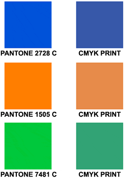
The simplest explanation is that Pantone is a popular spot color system and CMYK (four color printing) is a process printing system. Pantone spot colors are solid inks assigned numbers that look almost the same no matter who prints them, which is why spot color is especially important for corporate identities and branded images. CMYK colors, on the other hand, are created (processed) on the press using a mix between Cyan, Magenta, Yellow and black inks. Since there are variations between presses, press operators and other factors, CMYK colors are not guaranteed to be perfectly reproduced between printers or even print jobs
Always Convert Spot Colors to CMYK.
If you use spot PMS colors in your artwork that is going to be printed four color process, you may get some surprises. There are three things that can happen and they’re all bad.
The first is object effects, such as shadows or glows that can unexpectedly show up.
The second is when you use transparent images. Those images may no longer be transparent on top of the Pantone color and white areas will show up during printing.
Third is that some spot colors don’t convert well to CMYK. For example, Reflex Blue cannot be generated with CMYK. That’s why converting the spot color to CMYK before you submit art to us will show you what happens to those colors.
So ALWAYS convert spot colors to CMYK before giving us art. It will save a lot of headaches. You can do it in the software that you’re designing in, or in Acrobat Pro.
Always use CMYK. Never use RBG.
RGB colors (Red, Green, Blue) are designed for screen viewing. What you see is three colors of light combining on a bright monitor. White is a combination of all three colors combining. RGB colors are the addition of the three basic color.
Printing is done using CMYK (Cyan, Magenta, Yellow and Black – known as four color printing). It is the opposite of RGB in that colors cover each other. In CMYK, white is the absence of any color (if the paper is white). CMYK is subtractive, unlike RGB.
So to avoid any disappointment, ALWAYS use CMYK swatches and images. If you’re using spot colors, convert them to CMYK so you can see how they will look on paper.


Prevent Blues From Turning Purple
Blue is close to purple in the CMYK spectrum. Remember, use a low amount of magenta whenever using high amounts of cyan to avoid purple. For example, use C-100 M-70 Y-0 k-0


Black vs Rich Black
To create Rich Black make your color values:
60% C, 40% M, 40% Y, 100% K


